

Why did we need a new image? Is rebranding good for a company?
We have felt the need of a “refresh· for a while, turning 10 years old felt like the perfect te and excuse for it! We have been working on the color palette of our logo, website, communication strategy and even our offices and environment.
Yes. It can be overwhelming at times, but it is all a matter of prioritizing and organizing our ideas and needs. This is what we did.
We divided the process in three initial stages.
STAGE 1
Colors
After a long thinking period, going back and forwards with lots meetings, chats and some polls. I (the designer) was given total freedom to re think it by myself, which was great but also scaryW We were not sure as to where to start, but I am a huge fan of colors so I thought this action had to be the first one. The importance of color for a brand is essential! It is such a powerful tool to share ideals and goals in a non verbal way. We knew that we wanted to keep red, that is a color that has been with us for years. It is a powerful color, full of meaning
![]()
Why red?
The color red has many meanings: passion, strength and seduction. Moreover, it is sometimes also associated to danger, blood, and other not so positive aspects. This is why we have chosen to balance it by the secondary color, which ended up being purple.
![]() Why Purple?
Why Purple?
Purple has both red and blue in it, therefore it has both passion and loyalty. We talked about red already so let’s go with the next one: blue.
Blue associates to the open spaces, the sky, the ocean… therefore, depth. All this concepts together with the ones that purple represent convey in loyalty, sincerity, wisdom, confidence, stability. Excellent characteristics to support CavePot values.
![]() Why Aqua Blue?
Why Aqua Blue?
Following the concept of having supporting colors that have the others in them (meaning secondary colors), this aqua green tone has both green and blue in it. Green combines the power of blue and yellow. It is very meaningful since it is associated with growth, harmony, freshness, renewal and hope. This represents the state we are all in, constantly evolving to become our best version, personally, professionally and in terms of the company as well.
![]() Why yellow?
Why yellow?
For the fourth color I decided to choose one that harmonizes with the rest of the palette and also adds some light.
Yellow is the most luminous of all the colors of the spectrum. It’s the color of happiness, optimism, of enlightenment, creativity, sunshine and spring.
Let’s stop here for a second. So far I am sure you got an idea on what we are doing here, right? Two primary colors and two secondary ones, speaking in terms of the basic color wheel. Most of the tones we chose are complementary, this ensures good combinations and good tools for communication.
You may wonder why we need so many colors, which happens when a gray scale is needed. We thought of that too, specially for text, and even more specific for screen text. Have you ever felt more tired reading black test on a white screen? We feel you. From choosing the right font to choosing the right hue of black or grey is essential to provide the reader with a more comfortable experience. This all also depends on the background color that you choose to use and so on.
![]()
![]()
![]()
STAGE 2
Re-thinking the logo in terms of the icon and the meaning of the term “pot”, since it is both a cooking tool.. and well, also a herb that has a particular reputation in some places (lol). This had confused many a few times in the past. We decided not only to make this statement not the logo but also by telling our story and its reason for being a part our company name. We love storytelling so we thought that by combining the imagery and the tale the confusion would not be so recurrent.
We have always identified with vikings and their imagery, however in this new version of ourselves we decided to let go of those visuals and create our own. While we work on this new branding image we are also working on our culture and sense of belonging, for that we needed to ensure our authenticity. That meant creating new imagery. The one thing we felt comfortable with was the font we had been using for our logo, so we knew that the new one had to stay. That also helped us stay closer to our old version so that the change would not be so drastic.
Therefore our main front remained being Alpaca Scarlett. It is versatile, easy to read in many sizes an a typography that has character.
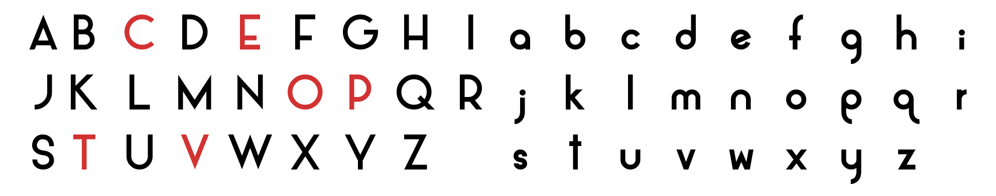
We have used 6 characters and made a few changes to personalize it slightly and make it ours. Before we move on to the logo, we also have a complementary font, used for any other texts other than the logo, that is a part of our brand. This one is the Monserrat, a great typography for long texts and it is a google font so it’s free to use!
Having two established fonts allows you to keep a steady look and feel throughout your different forms of communication, wether it is digital or printed.
Now, let’s move to the logo! Here is what we ended up creating, we knew we wanted to include a cooking pot, and what better place to do so than to use the letter O.
We first looked for image references to decide which kind of pot we would lean towards. So many options!
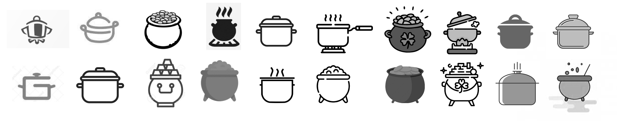
After we had a clear idea of the kind of pot we wanted to go for, we decided that, since we are a software company and not a food related one, we decided to make an icon out of the O, that resembled a pot but that was not too straight forwards. So we began sketching:
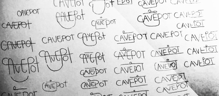
I believe bringing the ideas down in paper is helpful. It’s more loose and it allows a different workflow, after a little time we move to the computer and continue playing and trying new things.
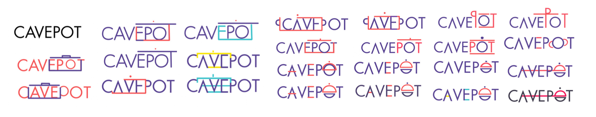
After this process we got the final design:

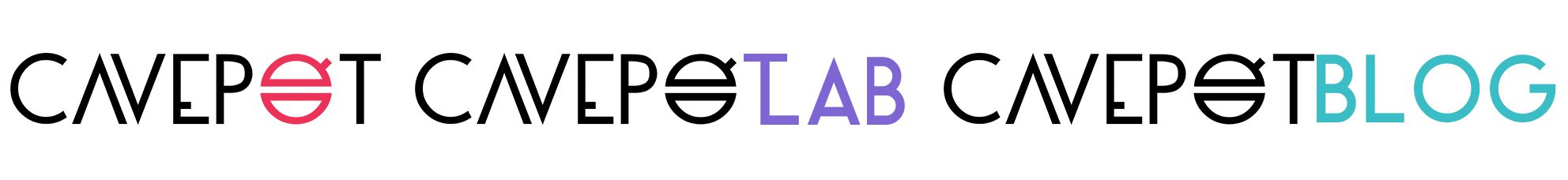
And the different variants, for our different areas:
 This is all for today, stay tuned for more! We have lots of other things about our rebranding process to tell you!
Thank you for reading, don’t hesitate to leave a message, we would love to hear from you!